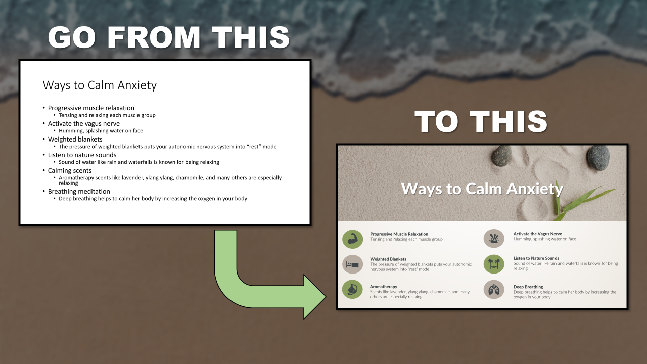
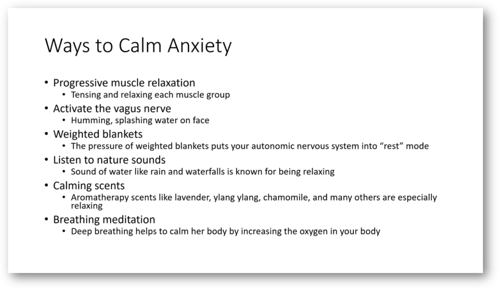
We have all experienced the dreaded PowerPoint presentation whether it be at work or for a class. The presenter is killing the audience with boredom bullet after bullet on each slide. Look at this slide below does it not make you want to just fall asleep right now.
Ok, don’t fall asleep. Why do we find bullet points so boring? Well, you and everyone that you present to has more of their brain dedicated to processing visuals than any other sensory modality – in fact it’s thought that about 20% of the cortex is responsible for visual processing [Wandell, Dumoulin & Brewer 2007]. A presentation with lots of bullet points reads more like a document or as it called a slidument. Honestly, a presentation was never supposed to be read like a document, it is meant to be a visual to enhance what you are saying. If you want to hold your audience’s attention you need to visualize what you are saying. I am going to show you five ways to spruce up your bullet point slides so you can avoid committing the crime of killing your audience with boring bullets points. The layouts are redesigns of the previous slide. The slide is from my presentation on managing anxiety. Each of the five ways are different layouts you can mimic for your next presentation.
Five Ways to Spruce Up Bullet Slides
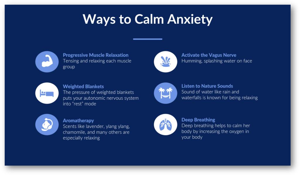
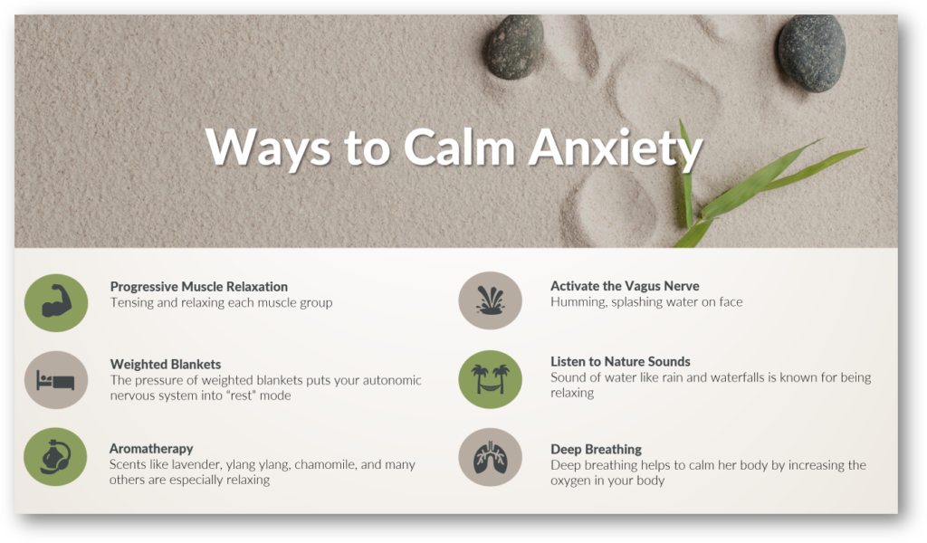
1. List Centered
The use of color and icons helps to create interest. The imagery of the icons helps the audience with retention of each of the items. This design is great especially if you do not want to use a picture(s) on your slides. It will give your presentation a professional and polished look.
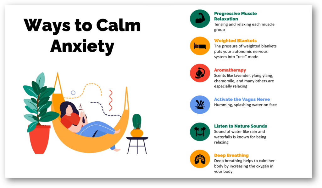
2. List on the Right Side
The title is in the top left corner with a picture underneath. The list with icons is on the right side.
3. List Going Across
The title of the slide is centered at the top. There is a picture going across the slide. The list with icons are going across the side.
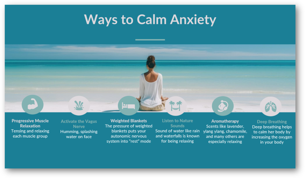
4. List at the Bottom
This slide design layout is similar to the first one. The main difference is the picture going across the top with the title overlaying the picture. The picture of the beach sand and the sandy color of the slide enhances the slide’s message of calmness.
5. No List
With this option there is no list at all. Pictures are used for each point instead of icons. There is a picture for each one demonstrating what it is saying. Using this layout will greatly enhance the audience’s memory of what you are saying more than the previous layouts. It uses more slides which allows the audience to digest the material in smaller chunks. So if retention of information is essential for your next presentation, I recommend using this layout. People can recall images faster than they can recall words. They may not remember the word you said but perhaps they will remember the picture.


To create interest throughout your presentation. I recommend using a combination of the five layouts. Maybe have one slide with design number 2 and the next slide with design number 5. The switch in layout will catch your audience’s attention. Now you may be thinking I understand I should make my slides more visual but that takes too much of my time. There is a reason most PowerPoint presentations suck. It takes time to create a PowerPoint presentation that not only contains great content but also great visuals. If this is you, we are here to help at Slide Navigator. We will handle the visuals for you so all you have to focus on is your content. Schedule free consultation.
Thanks very nice blog!
Hi! Someone in my Facebook group shared this website with
us so I came to check it out. I’m definitely enjoying the
information. I’m book-marking and will be
tweeting this to my followers! Outstanding blog and terrific design.