
Are you getting ready to send out your pitch deck to potential investors, hoping to secure investment for your company? If that’s the case, this article is tailored just for you. I’ve had the opportunity to speak with numerous venture capitalists and firms, and astonishingly, some of them review up to 1,000 pitch decks annually. That’s an overwhelming number. Naturally, it’s highly unlikely that they read every single deck in detail, as time constraints simply wouldn’t allow it. More likely, they skim through those decks, paying closer attention to the ones that immediately grab their interest. In this article, we’ll be sharing practical strategies to ensure that your presentation stands out amidst a sea of 1,000 pitch decks.
1. Condense Large Blocks of Text
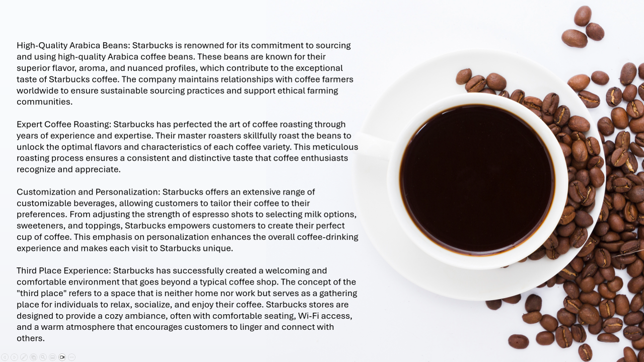
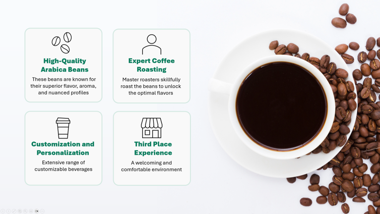
Investors are often pressed for time and prefer not to read extensive blocks of text. They prefer to skim through your pitch deck to quickly grasp the essence of your company. The purpose of the deck is to pique their interest, prompting them to explore further details about your company. You do not have to give them every detail there is to know about your business. It is advisable to minimize text and emphasize key points you wish to convey. Take a look at the example below to see how large blocks of text can be condensed.
Heavy Text Laden Slide
Text Condensed Slide

The provided slides for the coffee company exemplify how extensive blocks of text can be condensed into four concise bullet points. This reduction in text enhances the skim ability of the presentation, making it easier to read and comprehend.
2. Include Slide Headings
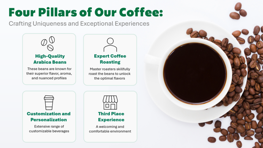
Including headings on your slides facilitates easier skimming, enabling investors to quickly grasp the main points you are communicating. In a presentation, it is important that viewers should be able to quickly understand the content of each slide without having to read it in its entirety. The slide heading should provide a clear indication of the slide’s topic.
Take a look at the slides below. One of them is missing the heading. That means whoever is viewing the slide will then have to read the entire slide before they understand what the slide is about. The slide with the heading allows
Slide WITHOUT Heading
Slide WITH Heading
3. Showcase Your Product/Service on the First Slide
Not displaying your product or service on the front cover can make it confusing as to what your company is about. Think of the first slide of your pitch deck like the cover of a book. It should clearly convey what your company is about just like the front cover of a book clearly conveys what the book is about. Consider the sample slides below.
First slide showing IRRELEVANT PICTURES

First slide showing RELEVANT PICTURES

4. Have a Consistent Design Throughout the Pitch Deck
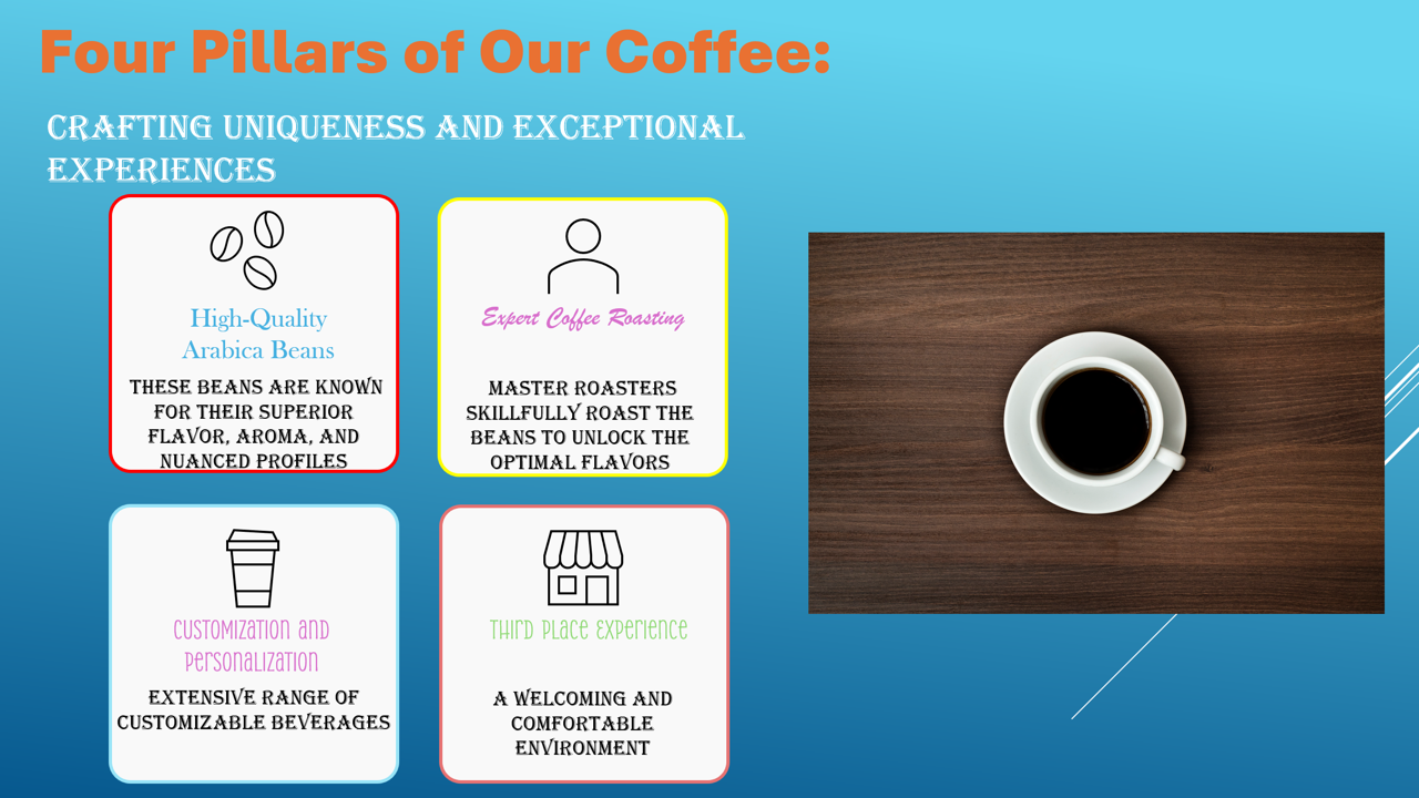
Inconsistency in the design elements of your pitch deck sends the wrong message to potential investors, indicating a lack of attention to detail and a potential lack of credibility. Your pitch deck serves as a visual representation of your business, and it should align with your brand identity to create a cohesive and professional impression on potential investors and partners. A pitch deck that reflects your company’s brand identity will be coherent in its color scheme, typography, imagery, and overall style. It helps build trust and credibility as they can associate your pitch deck with the established reputation of your brand. A consistent design also reflects a sense of professionalism, attention to detail, and a well-defined brand strategy
We have created a sample pitch deck for a fictional coffee company. Please take a look at the PowerPoint slides provided below. Imagine that this company intends to email this presentation to capture the attention of potential investors in order to secure funding. After reviewing both sets of slides, which set do you believe would be received more favorably by investors?
First Set of Slides

Second Set of Slides


In the first set of slides, you may notice that the font styles vary and there is no clear color scheme. This gives the presentation a messy appearance and creates the impression that the company lacks a cohesive brand identity. It seems hastily assembled and implies that the company may not take their own business seriously. This negatively impacts your credibility, leading people to hesitate in taking you seriously and feeling uncomfortable about entrusting you with an investment.
On the other hand, the second set of slides exhibits a professional layout with a consistent color scheme that aligns with the company’s brand. The chosen font is consistent throughout, enhancing the overall appearance. The second set of slides is more likely to be taken seriously by investors. It communicates that we are a professional company and are genuinely committed to the product or service we have developed. This consistency and attention to detail lend credibility to our presentation and reinforce the notion that we are a reliable and serious business entity.
Notice how, despite the content remaining identical, the presentation of the slides can impact how seriously your company will be perceived.
If you need help with an upcoming pitch presentation to make sure it stands out, you can schedule a free consultation with us at Slide Navigator.
Resources